Netflix Playlists
Role
UX Designer & Researcher
Timeline
75 hours
Tools
Figma, Miro, Whimsical, OptimalSort, Lyssna
Discover
“Scroll and scroll and scroll…” 🥱
Background
Netflix is a pioneer in the streaming services game since it launched online streaming in 2007. Users around the world have access to thousands of shows and movies (about 6,621 for American users in 2023) to bring up with just a click. But with so many options comes the paradox of choice; a psychological theory that giving consumers too many options produces anxiety and prevents them from making a choice. There are no shortage of online memes and jokes about people scrolling Netflix for hours and still having no idea what they want to watch.
Problem
Netflix users are having a hard time making a selection and often spend more time endlessly scrolling their options with frustration and indecision than watching content.
Research goals 🥅
What habits, motivations, and pain points do users have related to Netflix?
What role does “scrolling” and finding new media have in a person’s schedule?
Do users interact with the ‘My List’ feature and if yes, how?
Competitor analysis
I analyzed 4 competitors to get a sense of streaming service conventions and potential opportunities. A saved list and personalized recommendations were ubiquitous, but filters when searching were nowhere to be found.
User interviews
The internet has no shortage of good-natured jokes about people’s struggles with Netflix and “doom scrolling.” These actually served as a good starting point when determining what kinds of questions to ask interviewees, such as what they’re doing and who they’re interacting with while looking for a new show to watch.
I interviewed 7 people about their streaming habits and opinions on finding content. These users were between 25-65 years old with 3 being full-time workers, 2 students, and 2 retirees. These users were chosen because they used Netflix almost everyday and had “very strong” opinions on scrolling and finding new content.
5 out of 7 users actively seek out friend’s suggestions for content to watch.
4 out of 7 people search online for reviews and articles for inspiration on what new shows to watch. 3 of these users emphasized that good reviews were a major factor in influencing what they want to watch.
4 out of 7 users strongly dislike scrolling and won’t do so for more than 10 minutes to find content.
3 out of 7 users enjoy scrolling for content and will do so for 10+ minutes.
3 out of 7 people save shows and movies on Netflix’s ‘My List’ while 2 users said they’ve never used it.
2 users seek out new content by looking at Netflix’s ‘My Suggestions’ and ‘More Like This’ under a certain show, but 2 users ignore these sections and don’t think the suggestions are helpful.
1 user missed Netflix’s old ‘shuffle’ feature that suggested new shows while 1 other user tried this feature and hated it.
What did interviewees say? 👂
“I like that theres a lot of content, but at the same time there’s too much content and it’s overwhelming. Its hard to filter through everything.”
— User #2
“I don’t find many shows through just scrolling, my limit is 5 minutes, maybe less.”
— User #4
“I’ll watch the same shows and movies over and over again, it’s nice to have something on in the background.”
— User #3
“I like scrolling! I’ll spend 2 or more hours scrolling! I’ll scroll until I find something.”
— User #5
Affinity map
My assumption that “everyone hates scrolling,” was quickly shattered during these interviews. Many people do dislike it, but there was also a vocal group that enjoyed meticulously going through their options. Some of the main categories for the affinity map addressed how people find content, whether they tend to rewatch old content or seek out new shows, scrolling preferences, and general feelings on Netflix and other streaming services.
Define
User journey map
While everyone interviewed had a similar goal of wanting to watch good content, the way these interviewees discovered and watched shows was rather different. Before creating the user personas, it was important to dive a bit deeper into the different situations and struggles that impact user scrolling/watching habits with a user journey map and storyboarding.
Storyboard
Meet Abby, Kathy, and Carl! 🧍♀️🧍♀️🧍
3 people, 3 Netflix accounts, and 3 different ways of finding and watching content. The Creature of Comfort loves rewatching shows from her childhood, our Review Reader only watches top-quality content, and the Super Scroller just can’t get enough information about new shows and movies.
What common thread ties these 3 user personas together? 🧵
With such different user behaviors, what feature could possibly help all of them? Everyone interviewed had the same goal of wanting to find content to watch, but most had something else in common too: friend recommendations.
Whether it was occasional or daily, users were getting and giving suggestions from friends through Facebook, text message, and in-person. I took inspiration from Spotify, an app that also has thousands of content options for its users, that allows users to create and share customized playlists that suit every mood and situation. This would help cut down on the overwhelming number of options on Netflix and ensure a close friend or family member has already vouched for these shows/movies.
User flows - creating and saving playlists
Using Spotify’s UI as a starting point to hopefully invoke a familiar mental model for people. I made user flows for creating a playlist and finding and saving another user’s playlist.
Design
Paper prototyping & testing results
Before moving the designs to the digital space, 3 users completed moderated, remote testing of a paper prototype to determine if people could navigate adding content to a new or existing playlist and what they thought this feature was. There were a few apparent issues that needed to be addressed before the next iteration.
Problem: Netflix’s current name ‘My List’ is “confusing” and people are unclear what it means.
Solution: All 3 testers said the term ‘playlists’ was a more familiar term, so we’ll change the name to ‘My Playlists.’
Problem: There isn’t any mention of how many playlists a user has created.
Solution: The playlists page now has a subheader with how many playlists the user has created/liked.
Problem: 2 out of 3 users had trouble finding where this feature would be in the app.
Solution: Users have to click ‘My Netflix’ to access their list on the Netflix app, but the next iteration will have a button on the homepage as well to access playlists.
UI inconsistencies on the Netflix app
As the low-fidelity mockups were transferred to the digital sphere, I noticed a problem. When studying the current UI of the Netflix mobile app there were inconsistencies with UI patterns and UX best practices.
Netflix displays a red bar over certain selections with a bold white font on the ‘My List’ screen. But, on show and movie screens, the red bar remains over the selected option, but the white bold font is shown even on unselected options.
While creating this new feature, I chose options and made design tweaks that were consistent and reflected best UX practices.
Extra padding was added to certain sections to create “breathing room” in the final iteration of this project. We also used the selection pattern reflected on the ‘My Netflix’ screen to make it more obvious what selection users have made.
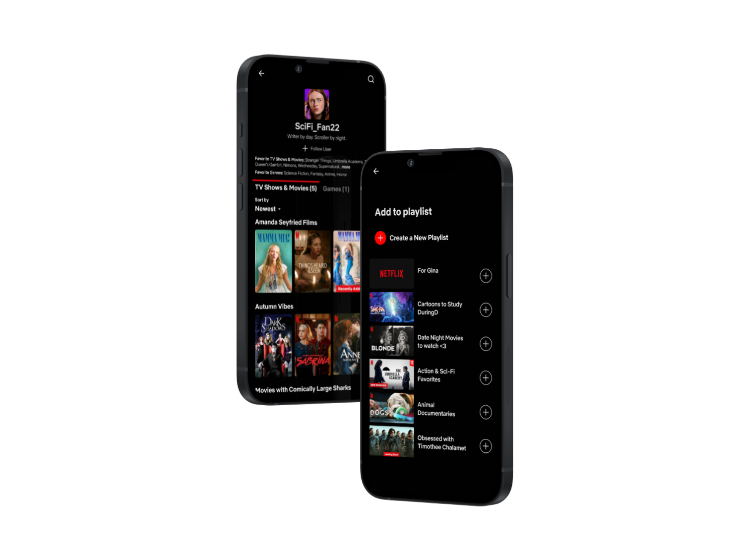
High-fidelity wireframes: from ‘my list’ to ‘my playlists’
With a new name, a few UI tweaks, and feedback from the first round of testing, the feature was looking good and ready for round 2 of testing. 7 users ended up testing this feature and were thrilled with the idea of being able to create playlists “like Spotify!” The response was enthusiastic, but a few changes were made to make the UX process as smooth as possible.
What did testers say? 👂
“I think this feature is really cool and clever; I love the ability to create and share playlists.”
— Tester #1
“This is a cool idea…especially for sharing recommendations with friends and finding curated recommendations from people instead of an algorithm.”
— Tester #3
“I save a lot of movies and shows and it’s pretty messy to look at, so this feature would make it easier and quicker to access what I need.”
— Tester #5
“This is a really cool idea! Especially with being able to look up other users and see what they’re watching.”
— Tester #2
Iterations
Problem: Some users couldn’t find the ‘my playlists’ button in the top carousel.
Solution: Move it to the front! Why not?
Problem: There’s no way for people to follow other users and stay updated on the playlists they create.
Solution: A ‘follow user’ option now appears near the top of other user’s profiles.
Problem: Users thought they’d pressed the wrong button and were looking at an individual show due to the single image.
Solution: Taking inspiration once again from Spotify, playlists now have an image autopopulated with 4 pieces of content from their playlist.
Problem: Users tried to get to their playlists through the ‘my netflix’ footer navigation icon.
Solution: Design a revamped ‘my netflix’ area with playlists and users people are following.
Deliver
Final prototype

Takeaways & the future of Netflix playlists 🔮
What a fun and unexpectedly challenging project to take on! I enjoyed studying and staying within the confines of a company’s existing design patterns, but also making executive decisions on the best design choices when I spotted unexpected inconsistencies.
The ideal next steps for this project would be:
Applying consistent UI patterns throughout the app that align with best practices.
Testing with users to determine if in-app sharing of playlists is desired and how to design that function.
Testing with users to see how much customizability they want with their playlists, such as selecting certain images to be displayed.