One Drop - blood donation app
Role
UX Designer & Researcher
UI Designer
Timeline
100 hours
Tools
Figma, Miro, Whimsical, OptimalSort, Lyssna, LottieFiles
Discover
Emergency blood shortage! 🩸
Background
In January 2024, the American Red Cross declared an emergency blood shortage and that donor levels in the United States are the lowest they’ve been in 20 years. Unfortunately, there is no synthetic product that can assist patients in need, only human blood will do. Mobile apps are a popular tool for donors to book appointments nearby, but are they catering to the needs of long-term and potential donors?
Problem
Mobile apps can help people book blood donation appointments to help with the national shortage, but current donors are displeased with some of the apps available to them and potential donors may not be getting the information they need to feel confident in booking an appointment.
Research goals 🥅
What habits and pain points do current donors have with their blood donation apps?
How do users find information related to blood donation, such as eligibility?
What can be done to encourage a new or potential donor to make an appointment?
Competitor analysis
I analyzed two apps that serve the United States, one from Canada, and one from New Zealand.
Blood donation apps in the United States and many English-speaking nations are mostly owned and run by government organizations or private businesses.
In some countries in the Middle East and Asia, blood donation apps are structured similarly to GoFundMe in which donors click on individual patient profiles and can donate to a specific person. I chose to model the app off the English-speaking country model.
Analyzing the features of each app was essential in parsing out which ones were industry standard, such as the scheduling tool. I also wanted to see features that seem popular but aren’t ubiquitous, like the virtual donor card and “blood journey” which shows donors when their donations have been processed and given to patients.
User interviews
The subreddit r/blooddonors on Reddit acts as a resource for new and old donors alike to ask questions and receive compassionate, informative advice. 6 of the 7 people interviewed came from this subreddit. Users were between 18-55 years old with 4 identify as long-term donors and 3 who were newer/potential donors. Users had a range of locations within the United States from rural homes to urban apartments.
7 out of 7 users prefer a physical gift for donating as opposed to a virtual reward or badge, but gifts aren’t the primary factor to donate, they’re seen as “the icing on top.”
5 out of 7 users do not use, and weren’t interested in, the social features in their donation apps.
4 out of 7 users love data and seeing as much information as possible about their health in an app.
4 out of 7 users have issues with scheduling, such as having to search for a time first in the Blood Donor+ app (“my schedule is different every day!”) or finding a center only to discover they only accept blood donations, not plasma or double red blood cells.
2 out of 7 users want to see more patient recipient stories in their apps.
2 out of 7 users want to see past blood journeys, not just their current one.
To find information on eligibility and the donation process, 2 users get information from health clinics, 2 call their doctors, 2 ask the phlebotomists at their appointment, and 2 use Reddit.
What did interviewees say? 👂
“I like that you can have your (virtual) donor card with you and have that handy.”
— User #1
“The footer nav…why are virtual badges listed here? What about health history? I look at my health information more than the badges, but it’s nested away.”
— User #5
“I'm a sensitive empath by nature, I want to see more patient stories and why people donate…I was roped in by those stories and that’s what made me want to be a long-term, frequent donor.”
— User #6
“The gifts aren’t why I donate, but it’s like a nice icing on the top sort of thing.”
— User #2
“I wish the app would show me past donation, but also past blood journeys.”
— User #2
Affinity map
The donors interviewed had a lot to say about their apps and experiences, so there was certainly a lot of information to sift through. When it comes to especially positive/negative experiences, that pertained mostly to the in-person aspect of donating, but that doesn’t mean there weren’t still plenty of comments about the digital side. Some of the major categories included scheduling, where people get their information, and rewards/gamification.
Define
Meet Paula and Kai! 🧍♀️🧍♂️
Thes users have similar goals of wanting to easily book appointments, but their experience with blood donation and their apps are just a bit different. Kai also cares a bit more about getting swag compared to Paula!
Prioritizing features
Based on the data, these were the key insights that guided the feature list:
In addition to scheduling, users prioritized educational resources and the blood journey when it came to features.
Virtual badges are featured in many competitor apps, but users found them confusing and prefer physical rewards over virtual tokens.
Users weren’t too enthused about the social aspect incorporated into other apps, so ‘teams’ are placed under ‘can come later.’
The emergency response system is under ‘can come later,’ as researching and designing this section wasn’t within the scope of this project.
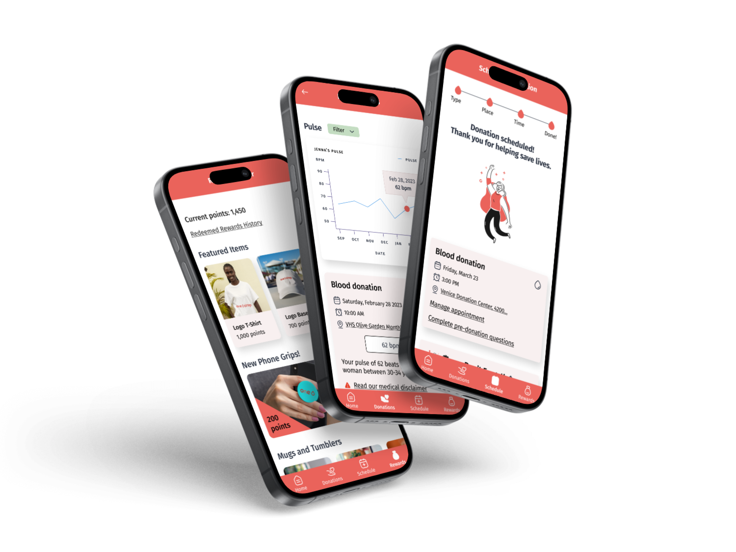
The site map features 4 main sections: home, donations, scheduling, and rewards. The homepage was designed to act as a hub for users to explore additional material. The virtual donor card and next appointment are at the top while patient stories and articles are further down for users who have more time and want to scroll.
Of course, the scheduling tool is the foundation of the app and making sure that process was quick and easy through a user flow was paramount.
Site map
User flow
Design
After completing the low-fidelity wireframes, I remotely tested them with 3 users. Each tester found the flows to be easy and quick to understand, but there were a few changes that needed to be made.
Low-fidelity wireframes & testing results
Problem: The blood journey looks more like a checklist than a cohesive journey.
Solution: Contain the journey within one card and connect the progress indicator marks.
Problem: Users didn’t know that current/past blood journeys were under ‘donations.’
Solution: Use the homepage to alert to new health/blood journey information to familiarize users with where to go in the future.
57% of comments from users reflected confusion and uncertainty about navigation
Brand identity
Crafting the brand identity for this project was a fun challenge. Most blood donation apps use a monochromatic red color scheme, due to the obvious subject matter, so I used a dark red for the brand color. Cool greens and blues are also used to create a calming effect for potentially squeamish users.
When sketching potential logo images, the idea of a little blood drop mascot was appealing, but 5 testers were recruited to choose their favorite logo and 3 out of 5 chose the circled logo.
The name ‘One Drop’ comes from the idea that every individual and drop of blood is invaluable to this organization’s mission. The red colors are all different hues of the brand color.
High-fidelity wireframes & testing results
When testing the high-fidelity wireframes, I tested navigability, but also if users could confidently interpret some of the more complicated information presented to them like the health metrics and blood journey.
10 users completed this round of testing, and the results were incredibly positive. Users who were very experienced with blood donation apps and those who had never used one before both had an equally easy time navigating the app and were very confident that they understood all the info presented.
After the redesign, confused comments from users dropped from 57% to 9%
Before
After
What did testers say? 👂
“I love this so much! My only complaint is that this doesn’t actually exist for my own blood donation center!”
— Tester #7
“I see how this would make blood donation more engaging, education, and rewarding.”
— Tester #2
“The colors and UI are great, everything exceeded my expectations.”
— Tester #4
“It was very intuitive and contained everything I would need and expect in a blood donation app.”
— Tester #5
Iterations
During testing, the only tricky area for 4 users had to due with the health metrics screen.
Problem: The graphs showing health metrics are interesting, but users expected them to be interactive and show the metrics right on the graph.
Solution: Make the graphs interactive! Show the selected health metrics on the graph itself too.
Problem: Users who were unfamiliar with blood donation apps weren’t certain where they could check their past health information.
Solution: Similar to the earlier blood journey problem, use the homepage to alert users to new health information to familiarize them with how to get to those screens.
Deliver
Final prototype

Takeaways & One Drop’s future 🔮
This was an incredibly rewarding project to work on with such interesting users to talk to. Everyone was excited to talk about their donation experiences and many even had notepads at the ready with extensive notes on what they did and didn’t like about their current apps.
Figuring out how to best organize some complicated information and metrics was a challenge, but frequent testing and returning to initial user interview data was incredibly helpful when making choices.
My dream next steps for the future of One Drop would be the following:
A homepage that has even more individualized stories and alerts for users.
An emergency response system that can communicate with users even during internet/power outages.
A more robust education/article/patient story section.