Scandinavian South

Role
UX Designer & Researcher
UI Designer
Timeline
65 hours
Tools
Figma, Miro, Whimsical, OptimalSort, Lyssna, Maze
Discover
“Hej! Välkommen!” 🏔️
Background
Locally owned businesses are a great asset to any community, but sometimes they don’t have the resources that major retailers do when it comes to creating a knockout site. Scandinavian South, a gift store and bakery in Sarasota, Florida, has been in business for more than 30 years and sells hundreds of authentic and charming items from Scandinavia. There shouldn’t be any problems then, right?
Problem
Scandinavian South sells unique, high-quality products, but their site navigation is confusing: each page has a different design, and the overall look is rather dated and not in line with modern ecommerce site conventions. Users may become confused and frustrated and decide to take their business elsewhere.
Research goals 🥅
What factors do users consider when determining a site’s trustworthiness?
What customer mental models and industry standards exist for ecommerce websites?
How do users navigate through a site with a very large inventory of products?
Competitor analysis
Before interviews, I took a look at other ecommerce websites, specifically those with hundreds of products, to see what existing industry standards there were and how they organized all of their items. The conventions that stood out were:
Search and filters.
Account creation with order history and wish list.
A header navigation bar (and sometimes footer) of high-level categories with more specific subcategories.
A checkout page with login or guest checkout.
User interviews
I interviewed 5 users who said they frequently shop online for gifts and food. Users between 25 and 65 were chosen who shopped frequently online, especially for others, and lived in suburban/urban areas where delivery times are typically not too long.
These interviews emphasized many insights that were gathered during the competitive analysis, which is that the current website doesn’t quite match the mental models and expectations of online shoppers.
5 out of 5 users would prefer to pay online for a product rather than order over the phone (an option on the Scandinavian South site).
4 out of 5 users make accounts on shopping sites for an easy checkout experience, discounts, and to check their order history.
4 out of 5 users would avoid using a site that looks outdated out of fear of getting scammed.
3 out of 5 users prioritize price the most when shopping online.
2 out of 5 users are cautious about saving their credit card information on multiple sites and prefer to use PayPal.
94% of user comments about the Scandinavian South site were negative/pain points related to design and navigability
What did interviewees say? 👂
“90’s website! It’s very dated, a lot of information is packed into the screen.”
— User #2
“I don’t like giving my credit card information to every store…I assume PayPal is safer.”
— User #3
“I’ve been gift shopping and think ‘oh that looks great,’ and then you navigate away and you can never find it again.”
— User #5
“Is there a shop all button? Or search and filters?…if I’m working with a budget, I want to sort by price.”
— User #2
“I used to (call to order) all the time back in the day, I can’t think of why I’d do that now.”
— User #3
“I make accounts just for the ease of ordering…I just click on the pay button and it’s done.”
— User #4
“The products look nice (on Scandinavian South) if I were in the market for some of this stuff, I wouldn’t hesitate to use it.”
— User #4
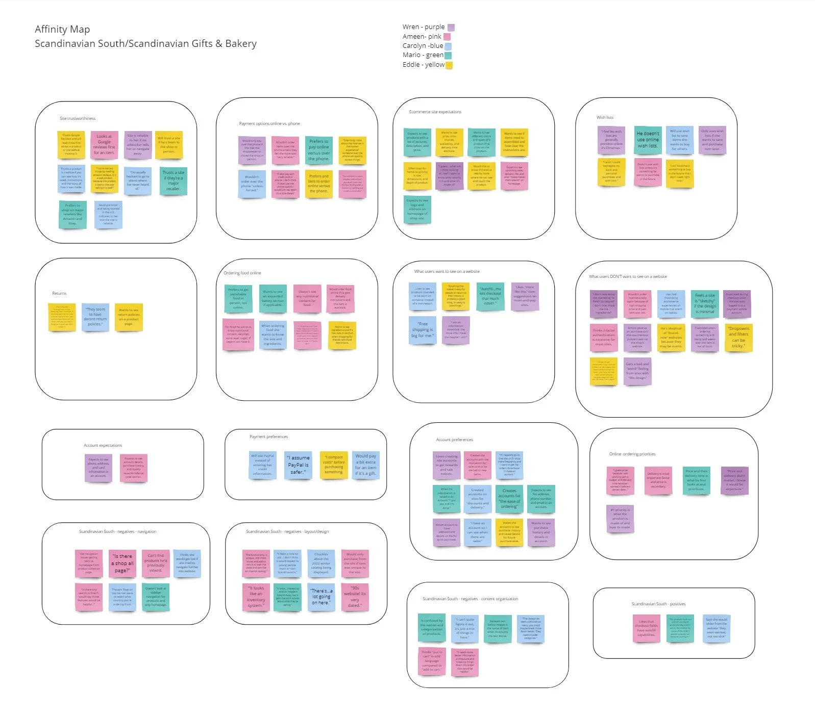
Affinity map
An affinity map was helpful in determining what users care about the most when shopping online and drove the high-priority changes on the current site. Some major categories include:
Site trustworthiness.
Payment method (online, PayPal, through the phone).
Account creation and wish lists.
Positive vs negative shopping and checkout experiences.
Define
Site map🗺️
One of the biggest challenges when redesigning this site was tackling the information architecture. Users thought the current structure was “confusing” and that there were too many “odd” categories.
After cataloguing how many products were available on the site (more than 400), I asked these questions to guide the creation of the site map:
What categories have the biggest number of products? There were more than 200 products for the home and more than 100 types of food for sale.
What specific categories could be made broader? For instance, Hinza tote bags could be nested under the more recognizable term ‘bags.’
What characteristics are mentioned the most in item descriptions? The country of origin and brand were called out for almost every item.
User flow: going from 20 product pages to 1
2 of the 5 interviewees who explored individual product pages said they were confused that products, such as the Hinza brand tote bag and Danish kringle, had each color and flavor listed as a separate product instead of a single item with a dropdown. These same two users also quickly noted that there wasn’t a way to order the kringles online.
It was time to craft a simple user flow that would allow users to quickly customize the color, flavor, and size of a product on one screen.
Design
Low-fidelity wireframes & testing
Before moving onto high-fidelity wireframes, I tested the desktop site with 3 users. Gauging the navigability of the site, especially the header bar, was the main testing problem. Users were also asked how easy the login and checkout process was and what the site was selling. Results were very positive, and users had an easy time logging in, checking out, and customizing a Hinza tote for purchase. There was only one issue…
Problem: 0 out of 3 users knew what ‘perishable foods’ were and that pastries were nested under this navigation item.
Solution: List out the 3 perishable items under ‘Food.’
Branding & logo - seeing double 👀
The curent site didn’t seem to have a brand identity yet, so it was important for me to create one to maintain consistency and visual harmony. However, there was a big problem that I hadn’t been noticed yet: the store had two different names and logos!

Neither logo seemed to be very high resolution, so a redesign was needed. The name ‘Scandinavian South’ was chosen because:
Scandinavian South matched the site domain.
This name is more distinctive and emphasizes the connection to Southern Florida.
‘Baked goods and grocery’ seemed misleading as there is only one type of baked good for sale.
I ultimately made a simple wordmark logo that was inspired by old Nordic runes.

Blue was a pleasant choice, connecting the icy oceans of Scandinavia to the warm waters of Florida. The gold shade evokes the sandy Florida beaches, but also the warm and vivid tones of Scandinavian buildings.
Icons selected were simple, but had a unique flair. Instead of a shopping cart there’s a basket and the heart/add to wishlist icon with delicate, twirling lines was inspired by traditional Scandinavian wooden folkart.
Välkommen to our high-fidelity wireframes!
Everything was looking good, so it was time to see what users thought. 5 people completed testing and each task was completed successfully in under 1 minute. Feedback was unanimously positive, and users noted there weren’t any pain points or frustrations when completing the 4 flows.
After the redesign, negative comments/pain points about design and navigability went from 94% to 19%
Before
After
What did testers say? 👂
“It was easy to locate the products by category as well as to select the type of product.”
— Tester #2
“There’s a feeling of warmth and a broad variety of interesting Scandinavian products to purchase…it’s clean and easy to understand.”
— Tester #5
“The navigation and checkout process was smooth and mirrored experiences on other sites.”
— Tester #4
“Overall I feel a little overwhelmed with all the choices of items, but I do think it looks well-organized at the same time.”
— Tester #3
Next steps? Iterations
Testing results were extremely positive, and the only bit of critical feedback was 1 user who found the homepage “overwhelming.” More white space was added to create more breathing room, but that begged the question: what else? Testing proved that the UX was solid, so returning to the initial research was necessary for inspiration.
Users were very vocal about how outdated the current site was, so I thought it was a good idea to research current ecommerce trends and make certain the UI of the site felt modern, but still retained a mom-and-pop-shop charm. A trend frequently mentioned was microanimations, so a few were added to create a subtle sense of delightful movement.
Homepage
The picture carousels are interactive and have a ‘see all’ image instead of an underlined link.
The larger product collection images enlarge slightly upon hover.
Product pages
The yellow card with the item information was removed for a more modern feel.
The heart/add to wishlist icon is animated
The product picture carousels are interactive and display arrows on either side.
Deliver
Final prototype

Takeaways & Scandinavian South’s future 🔮
I chose this challenging project to improve my information architecture and visual design skills. Crafting a site map that wasn’t too overwhelming and allowed people to easily find products was difficult, so testing results that confirmed how easy it was to find items on the site redesign was very rewarding.
Reflecting on this project, there are a few things I would’ve done differently. I didn’t work with the client, so I spoke to general online shoppers as opposed to Scandinavian South’s customers. I would’ve liked to speak to frequent customers and see if the store also received bulk orders and how could I best cater to that audience as well. If I were to continue this project in the future, I would want to:
Build out the reviews/product information/delivery sections.
Create the user account interface with order history and shipping information.